

Speckle Intelligence dashboards are available on your plan. For current limits and pricing, see
your workspace billing or the Speckle pricing pages.
If you blend model data with other sources, join the Databricks integration study on the User
testing opportunities page.
If you are here for validation widgets specifically, use Validation Widgets in
Dashboards.
Get started
1
Access Dashboards
From your Speckle workspace, click Intelligence in the top left to open the workspace
dashboards page. You can also open dashboards from within a project: open the project, then
click the Dashboards tab in the project navigation (with Models, Issues, Automations,
Collaborators, Settings).
2
Create your first dashboard
Click Add dashboard to create a new dashboard. You’ll be taken to the dashboard editor.
3
Add a model viewer
Drag a Model Viewer widget from the left sidebar onto the canvas. Select a project and model
to display. The model viewer acts as the data source for other widgets.
4
Add analysis widgets
Drag additional widgets (charts, tables, etc.) from the left sidebar. Widgets will automatically
display data from the model you’ve added.
5
Configure interactions
Click on widgets to configure their settings. Widgets can filter data, colorize the model, and
interact with each other.
Dashboard navigation overview
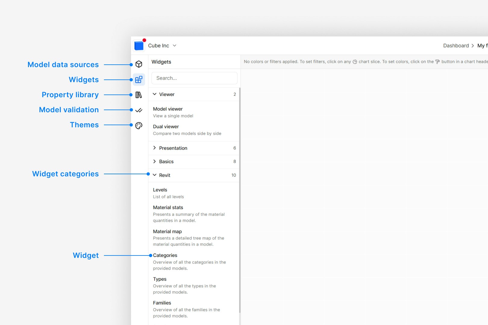
The images below illustrate the structure and layout of the dashboard.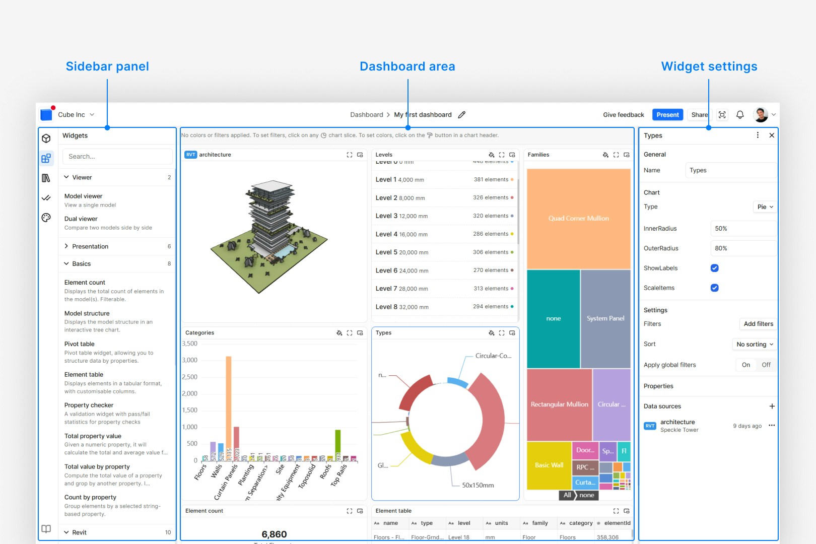
Bring in your data
Your dashboard needs at least one model; the Model Viewer widget provides that data to every other widget. The model viewer displays your 3D model; a Dual viewer widget lets you compare two models with a swipe/slider reveal from one shared camera. In dashboards, each data source has a 1:1 relationship with a model loaded via a model viewer. Model-less data sources are not yet supported.Adding models
To add a model:- Drag the Model Viewer widget onto the canvas
- Select a project from the dropdown
- Select a model from that project
- Choose whether to load the latest version automatically or pin to a specific version
Change a pinned version
When a model has moved on and you want the same charts and tables to follow a different version — without deleting the source, remounting it, and re-pointing every widget — change the pin in place from the Sources sidebar.- Open Sources in the left sidebar.
- On the model row, choose Change version (or the pin control that lets you pick another version or latest).
- Confirm the new version (or unpin to track latest).
Comparing models and versions
Some widgets support multiple data sources. You can compare different versions of the same model, models from different disciplines, or models from different projects. Widgets with multiple sources offer two modes:- Aggregate mode: Combines data from all sources into a unified view. Use this to analyze data across multiple models or versions together.
- Compare mode: Shows differences between sources. Use this to identify what’s changed between versions or what differs between models.
Model viewer features and sync
The Model Viewer and Dual viewer widgets share the same 3D controls. Hover over a viewer to show the toolbars.Top-right toolbar
- Lock interactions: Turn on to prevent pan, zoom, and orbit so viewers can be compared without accidental moves.
- Save / load camera view: Save the current view so the model loads at that angle next time; clear to reset.
- Fit: Frame the full model (or current selection) in view.
- Projection: Switch between perspective and orthographic.
Bottom toolbar
The bottom toolbar (Measure, Section, View modes, Light controls) matches the main Speckle 3D viewer. For details, see Interface and Navigation; for measure, section, and lighting in depth, see Exploration and Presentation.Sync camera (sync views)
When the dashboard has at least two data sources (e.g. two model viewers, or a Dual viewer with two models), each viewer widget has a Sync camera option in its sidebar. Turn Sync camera on for the viewers you want to keep in sync. When sync is on, panning, zooming, or orbiting one viewer updates the others so you can compare models from the same viewpoint. Sync requires at least two data sources; the option is disabled otherwise. See the video here on how to use sync camera.Dual viewer
Dual viewer compares two models or versions with a swipe/slider between panes. The cameras in both panes stay synced — you always navigate one shared viewpoint.- Both panes need a model before either side renders.
- Section box and measurements are not available on Dual viewer (they are misleading on a split view).
- Bottom view-mode controls drive the left pane; modes mirror to the right.
Context models
Use a context model when a model should appear in the 3D view for spatial reference but should not be affected by dashboard filters in that viewer. A site model, existing conditions, or surroundings mesh are typical examples when you are analyzing design schemes on the same canvas. By default, every model loaded in a Model Viewer is a data model. Dashboard filters isolate or hide objects in data models, and colorization from widgets applies to them. To mark a model as context:- Load two or more models in the same Model Viewer (sidebar Models → Add model).
- Select the viewer and open Models in the widget sidebar.
- Open the ⋯ menu on the model row.
- Choose Use as context model.
- Its geometry stays fully visible when page-level filters isolate objects in your data models.
- Filters that only target a context model are ignored by that viewer.
- Widget colorization driven by filters does not isolate or ghost context model objects.
Can I add multiple models to one dashboard?
Can I add multiple models to one dashboard?
Yes. Add multiple model viewer widgets; other widgets can then connect to any of them as their
data source.
Can I compare models from different software?
Can I compare models from different software?
Yes. As long as both models are in Speckle, you can compare them. The comparison works on shared
properties between the models.
Can I use models from projects where I'm only a viewer?
Can I use models from projects where I'm only a viewer?
Yes. If you have access to the project you can add its models to a dashboard.
When does dashboard data update?
When does dashboard data update?
Dashboard data updates when you load or reload the page. If the model viewer uses “latest”, it
fetches the latest version at that time.
How do dashboards relate to sync limits?
How do dashboards relate to sync limits?
Loading or refreshing a dashboard that displays model data counts as a productive receive
toward your workspace’s monthly sync usage. So opening a dashboard or reloading the page (when
the model viewer fetches a version) consumes sync. For how syncs are defined, how limits work,
and how to view usage, see Sync Usage in the New plans
FAQ.
What happens if a project or model I use is deleted?
What happens if a project or model I use is deleted?
Dashboards are defined at the workspace level. If a project or model that a dashboard uses is
deleted, the dashboard will break—widgets that depend on that data will no longer have a valid
source.
Can I pass configuration values via the URL?
Can I pass configuration values via the URL?
Yes for Scenarios. Apply a scenario and share the dashboard URL with
?scenario=<id> so recipients open the same filters and colour-by. Other configuration (project, model, or arbitrary filter params) is not passed via the URL yet — tell us what you need via the Dashboards category on the Speckle Community or Intercom.When should I use a context model?
When should I use a context model?
Use a context model when you need geometry in the 3D view (for example a site or existing
building) but do not want dashboard filters to isolate or hide it. Typical cases: comparing
several design options in one viewer while keeping the site visible, or showing surroundings
while charts tabulate only the schemes you connect as data sources.
Widget groups in the sidebar
The widget panel in the dashboard editor groups widgets by category. Each group has a particular focus. Model Validation lives in its own category (Validation) and is shown separately in the sidebar; availability may depend on your workspace plan.This section is for dashboard-based validation widgets. For that path, use Validation Widgets
in Dashboards. For Data Validation (checks and
standards), use Data Validation Overview.
The exact groups and widgets you see depend on your workspace and connected data sources. Use the search box in
the widget panel to find a widget by name or description.
Experimental widgets are marked with a Beta badge in the widget panel so you can quickly identify features that
are still evolving.
Choosing the right widget
Use this table to pick a widget for what you want to do.
🔄 = supports Compare mode (multiple data sources).
Aggregation and numeric display
Total property value and Total value by property calculate with the method you pick in widget Settings → Aggregation:
When Aggregation is Sum, Total property value also shows a secondary average under the
primary number.
Several numeric widgets also have display controls in Settings:
- Rounding — Always available. Options: 2 decimals (default), 1 decimal, 0 decimals, Auto, Locale, or Off.
- Display unit — Appears when the selected property (or ratio operand) has area units. Choose Source, m², ha, ft², or mm². Aggregation stays in source units; the widget converts for display, then rounds. Auto rounding may switch large areas to hectares (for example 12,500 m² → 1.25 ha).
How to connect a widget to a model
How to connect a widget to multiple models
Can I make my own widgets?
Can I make my own widgets?
Partially. You can customize dashboards with built-in Text / Markdown, Image, and
Embed widgets, and with Themes (chart and validation colors). There is not yet a public
API to build custom widgets that plug into the dashboard. If you need custom widgets or
integrations, get in touch via the Dashboards
category on the Speckle Community or
Intercom. For custom applications built on dashboard capabilities (Enterprise), see the next
FAQ.
Can I build custom applications with Speckle dashboards?
Can I build custom applications with Speckle dashboards?
Yes. Enterprise customers have been working with us to deliver custom applications via dashboard
capabilities. Build with Speckle describes how we
partner to extend and embed Speckle. If you want custom dashboards, integrations, or embedded
analytics, get in touch via the Dashboards
category on the Speckle Community or
Intercom.
Chart types
Many widgets (Count by property, Total value by property, and others) let you switch between chart and list views. Use the Chart Style or Type setting in the widget to choose how data is shown.The labels in my chart are outside the widget and I can't read them. What can I do?
The labels in my chart are outside the widget and I can't read them. What can I do?
Some chart widgets let you adjust margins and label placement. Select the widget, open its
Settings in the sidebar, and look for options such as margins, padding, or label position.
Increase margins or change the label setting so labels fit inside the widget. If the widget has
no label options, try resizing the widget or switching to a different chart type (e.g. Grid or
List) to see values in full.
Can I change the chart type after adding a widget?
Can I change the chart type after adding a widget?
Yes, for widgets that support multiple chart types. Use the Chart Style or Type setting
in the widget settings to switch between Pie, Bar, Tree, Grid, List, or Drop down. Some widgets
(e.g. time-based or version-over-time) use a fixed chart type and do not offer this switcher.
Why are my chart labels overlapping or cut off?
Why are my chart labels overlapping or cut off?
Long labels or many categories can overflow the chart area. If the widget supports it, adjust
margins or label settings in the widget settings. Otherwise, resize the widget, reduce the
number of categories (e.g. with a filter), or switch to Grid or List to see all values in a
table.
Property selection and the property library
You can choose which properties to display in two ways: inside a widget, or from the property library. You also select properties when adding filters (e.g. filter by Category or Level); see Filters for filter levels and operators.- In a widget
- Property library
Many widgets (Count by property, Total property value, Element table, and others) prompt you to select one or
more properties for display. Use the widget’s settings or property dropdown to pick the property; the widget
then shows values, counts, or breakdowns for that property.es. How to Add an Element Table with Multiple Properties